



Client Name · 2024
Project 04
Rebuilt sign-up for a digital bank and cut the time to a first account from nine minutes to three.
- Time to open an account
- −67%
- Completed sign-ups
- +38%
- Sign-up support tickets
- −52%
- App store rating, up from 3.9
- 4.7
At a glance
The short version
- Challenge
- 62% of new customers abandoned sign-up before opening an account.
- Solution
- A guided three-stage flow with inline checks, asking later for anything that could wait.
- Impact
- Time to an account fell from nine minutes to three; completed sign-ups rose 38%.
Overview
The brief
A fast-growing digital bank was paying to acquire customers who never finished signing up.
Sign-up had grown one requirement at a time: compliance checks, marketing consent, product preferences. Each made sense alone; together they turned a promise of "an account in minutes" into a nine-minute form most people abandoned.
I led design end to end, from research through launch, working with product, compliance and engineering to rebuild the flow without dropping any regulatory step.
My role
My role
Lead designer from first interview to launch, in a cross-functional squad of seven.
What I did
- Planned and ran the research
- Led workshops with product, compliance and engineering
- Designed flows, UI and prototypes
- Ran three rounds of usability testing
- Worked with engineering through launch
Deliverables
- Research report and journey map
- User flows and wireframes
- High-fidelity designs for iOS, Android and web
- New design system components
- Rollout and measurement plan
- Faisal MukhtarLead Product Designer
- Product ManagerScope and roadmap
- UX ResearcherInterviews and testing
- Engineering2 mobile, 2 web
Problem
Why people dropped off
Business goals
- Lift completed sign-ups by 25%
- Keep every compliance check
- Reduce sign-up support load
User goals
- Open an account in one sitting
- Know how long it will take
- Trust where personal data goes
Success metrics
How we measured success
Agreed with product and the business before any design work started.
| Metric | Baseline | Target | Result |
|---|---|---|---|
| Completed sign-ups | 38% | 48% | 52% |
| Median time to an account | 9 min | 5 min | 3 min |
| Sign-up support tickets | 1,400 / mo | 1,000 / mo | 670 / mo |
| Compliance steps | 14 | 14 | 14 |
Constraints
Constraints
Business
- Ship within one quarter
- No new vendors
Technical
- Legacy identity service
- Shared codebase for iOS and Android
Regulatory
- Every KYC step stays
- Consent must be explicit and logged
Research
Listening before drawing
Two weeks of mixed-method research to find where, and why, people gave up.
- User interviews
- 14
- Survey responses
- 340
- Session recordings reviewed
- 1.2k
- Competitor flows audited
- 6
Sara, 29
Switching from a traditional bank
“I gave up when it asked for a document I didn’t have on me.”
Needs
- Finish in one sitting
- Save progress and come back
Frustrations
- Surprise document requests
- No idea how many steps are left
Omar, 41
Small business owner
“Why does it need all this before I’ve even seen the app?”
Needs
- See the value first
- Clear reasons for each question
Frustrations
- Marketing questions mixed with legal ones
- Errors only shown at the end
| Competitive audit | Ours (before) | Bank A | Bank B | Neobank C |
|---|---|---|---|---|
| Time to open | 9 min | 6 min | 12 min | 4 min |
| Progress shown | – | ✓ | – | ✓ |
| Inline validation | – | – | ✓ | ✓ |
| Save and resume | – | ✓ | – | – |
| Explains data use | – | – | – | ✓ |
Insights
What we learned
Uncertainty, not length, drives drop-off
People tolerated long forms when they could see the end. The worst exits came straight after unexpected steps.
Errors arrived too late
41% of failed attempts were rejected at the final submit, after every field was filled.
Half the questions could wait
Only 9 of 22 fields were needed to open an account. The rest could be asked later, in context.
Trust is built in the details
Explaining why a document is needed raised willingness to share it in testing.
Architecture
Information architecture
Card sorting with 12 customers reshaped navigation around what people do, not how the bank is organised.
Before
- 7 tabs, named after bank departments
- Cards buried under Services
- Two separate settings areas
After
- 3 tabs: Home, Accounts, Profile
- Cards one tap from Home
- One place for security and settings
Process
From insight to interface
- 01
Discover
Interviews, analytics and funnel review
- 02
Define
Problem framing and success metrics
- 03
Ideate
Flows and sketches with engineering
- 04
Prototype
Clickable flows in Figma
- 05
Test
3 rounds, 18 participants
- 06
Ship
Staged rollout behind a flag
Decisions
Key design decisions
Decision 01
Show progress and time left
A three-stage progress bar with an honest time estimate replaced the open-ended scroll.
- Answers the top question from interviews: "how long is this?"
- Stages map to real milestones, not form pages
Decision 02
Validate as people type
Inline checks catch mistakes field by field instead of rejecting the whole form at the end.
- Removed the most common reason for failed submits
- Plain-language messages, written with compliance
Decision 03
Ask later what can wait
Preferences and marketing consent moved after the account opens, asked in context when they matter.
- Sign-up went from 22 fields to 9
- Consent rates held steady once asked in context
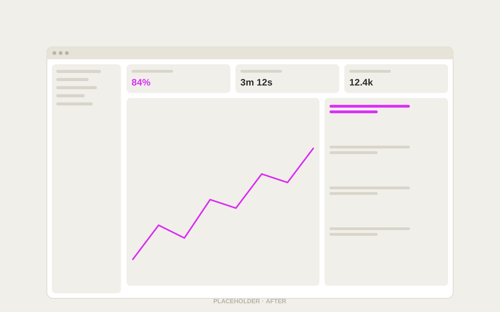 BeforeAfter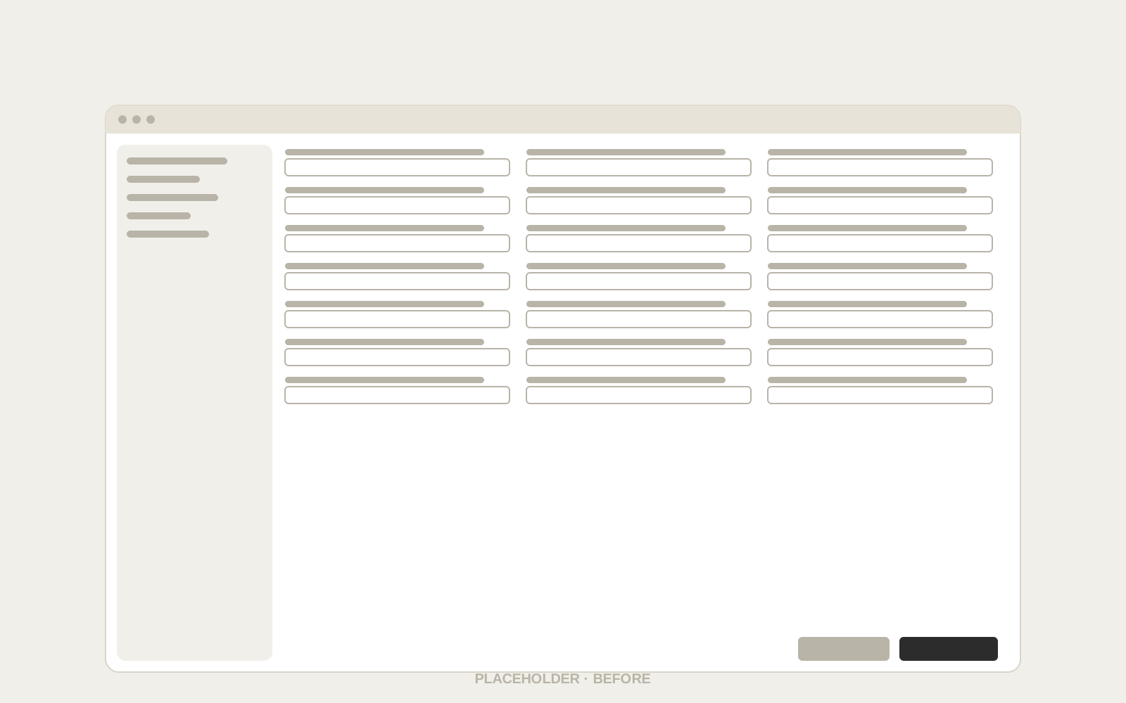
Iterations
How the design evolved
Each round of testing changed the design. Three versions, one problem fixed at a time.
- Version 1
One long form, split into pages
Faster to read, but people still couldn’t tell how much was left.
- Version 2
Stages with a progress bar
Drop-off halved, but errors still appeared only at the end.
- Version 3
Inline checks, deferred questions
The shipped design: 9 fields, real-time validation, three stages.
UI showcase
The final interface
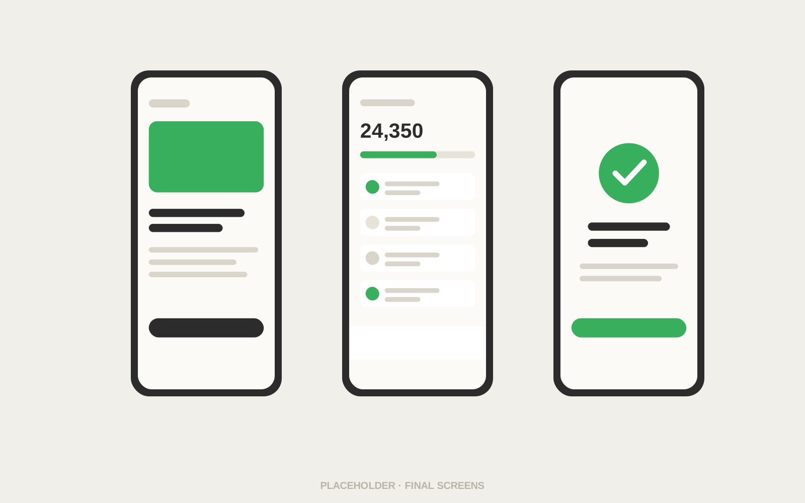
A calm, guided experience across iOS, Android and web, built on one shared design system.
Prototype
Try the prototype
 Clickable Figma prototypeThe full sign-up flow, from welcome to a working account. Best viewed on a phone.Open in Figma
Design system
Design system
New patterns were built as reusable components, so the rest of the app could adopt them.
- Ink#2C2C2C · Text
- Paper#FBFAF7 · Surface
- Signal#DB30F5 · Action
- Success#2F8A4C · Status
- Stone#D9D5CB · Lines
- DisplayInter Bold · 32/36Your account, in 3 minutes
- TitleInter Semibold · 20/26Verify your identity
- BodyInter Regular · 16/24We’ll check it in the background while you continue.
- CaptionInter Medium · 13/18Step 2 of 3 · about 2 minutes left
Accessibility
Accessible by default
- WCAG 2.2 AA contrastEvery text and control pair checked in light and dark mode.
- 44pt touch targetsIncluding the stepper and inline actions.
- Dynamic type to 200%Layouts reflow instead of truncating.
- Screen reader orderTested with VoiceOver and TalkBack on every step.
- Errors in words, not colourEach message says what happened and how to fix it.
Testing
Usability testing
Three rounds with 18 participants. Each round fixed the biggest problem from the last.
The biggest jump came from inline validation: people fixed mistakes as they went instead of hunting for them after a failed submit.
Results
Impact
Measured over the first eight weeks after full rollout.
- Median time to open an account (from 9)
- 3 min
- Completed sign-ups
- +38%
- Sign-up support tickets
- −52%
- Compliance steps removed
- 0
The new sign-up paid for the whole quarter’s roadmap within a month.
Next steps
What comes next
Now
- Save and resume across devices
- Per-field drop-off tracking
Next
- Instant ID check with the camera
- Joint accounts in the same flow
Later
- Business accounts
- Open banking import of existing accounts
Learnings
Looking back
What worked
- Bringing compliance into design reviews from week one
- Testing wireframes before visual design
- Shipping behind a flag to compare cohorts
What I’d do differently
- Instrument drop-off per field from day one
- Involve support earlier for real error wording
- Plan the save-and-resume flow upfront