



Lulu Hypermarket · 2024
Lulu Design System
An atomic design system for the Lulu Hypermarket app that cut design time by 35% and raised its accessibility score from 68% to 92%.
- Less design time
- 35%
- Better design–dev accuracy
- 45%
- Faster feature releases
- 50%
- WCAG score, up from 68%
- 92%
At a glance
The system in brief
- Goal
- Support rapid feature development and reduce design–developer misalignment across the mobile app.
- The system
- Design tokens, a component library and interaction guidelines, built on atomic design and aligned with brand standards.
- Impact
- 35% less design time, 45% better design–dev accuracy, and an accessibility score up from 68% to 92%.
Overview
About Lulu’s Design System
Lulu’s Design System is a centralized, scalable framework built to maintain visual consistency, functional reliability, and development efficiency across the mobile ecosystem. It includes a comprehensive set of UI components, design tokens, and interaction guidelines, all aligned with brand standards. The system was crafted to support rapid feature development and reduce design–developer misalignment.
My role
Lead designer on a team of two
- Design tokens definition
- Component library creation
- Accessibility guidelines setup
- Atomic design documentation
- Handoff optimization
- Team workshops
Principles
Design ethos behind the system
- Clarity
- Every element, from components to documentation, was created with clarity and purpose, reducing ambiguity for both designers and developers.
- Efficiency
- By eliminating repeated work and providing ready-to-use assets, we significantly reduced design and development time.
- Accessibility
- We followed WCAG guidelines to define colour contrast, type sizing, and touch targets, making the experience inclusive for all users.
Atomic design
What is an atomic design system?
Atomic design is a way to break down an app into small, reusable building blocks. Just like atoms combine to form molecules and organisms in nature, you start with simple elements like buttons (atoms), combine them into more complex components like forms (molecules), and eventually build full pages (organisms).
Typography
Nunito, a friendly sans-serif
Nunito is a clean, modern sans-serif typeface with a balanced and friendly feel. It helped enhance readability and added a smooth, welcoming tone to the Lulu Hypermarket app.
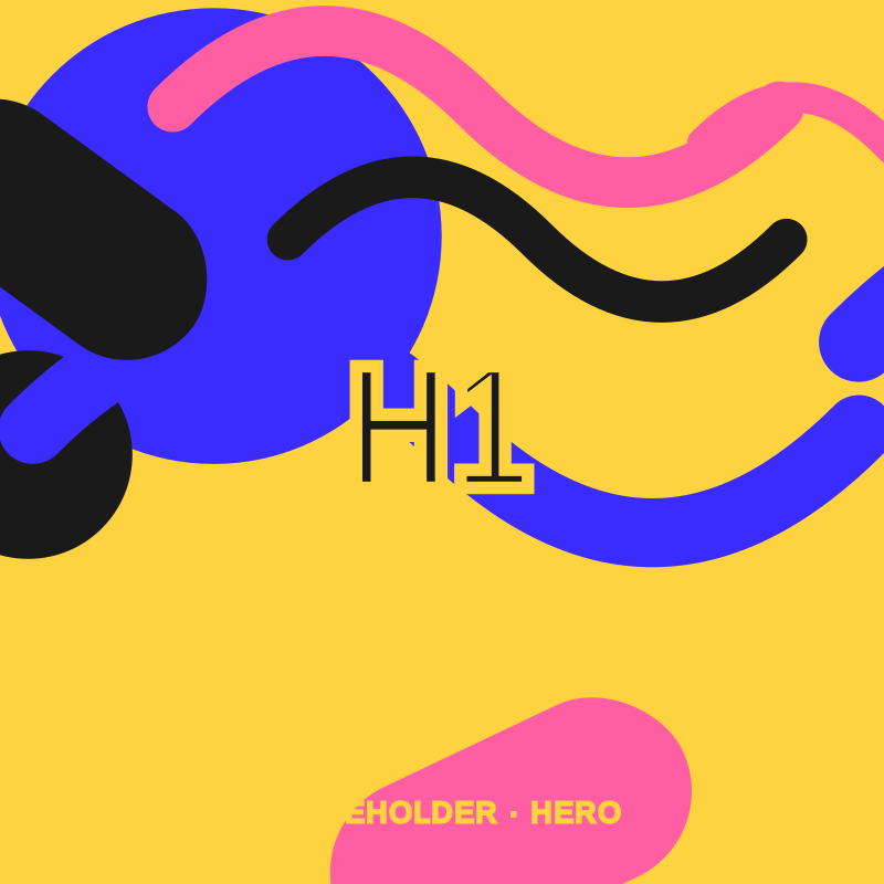
- Heading / H1Nunito Bold · 44/48 · −0.5pxEmpty states and feature introductions
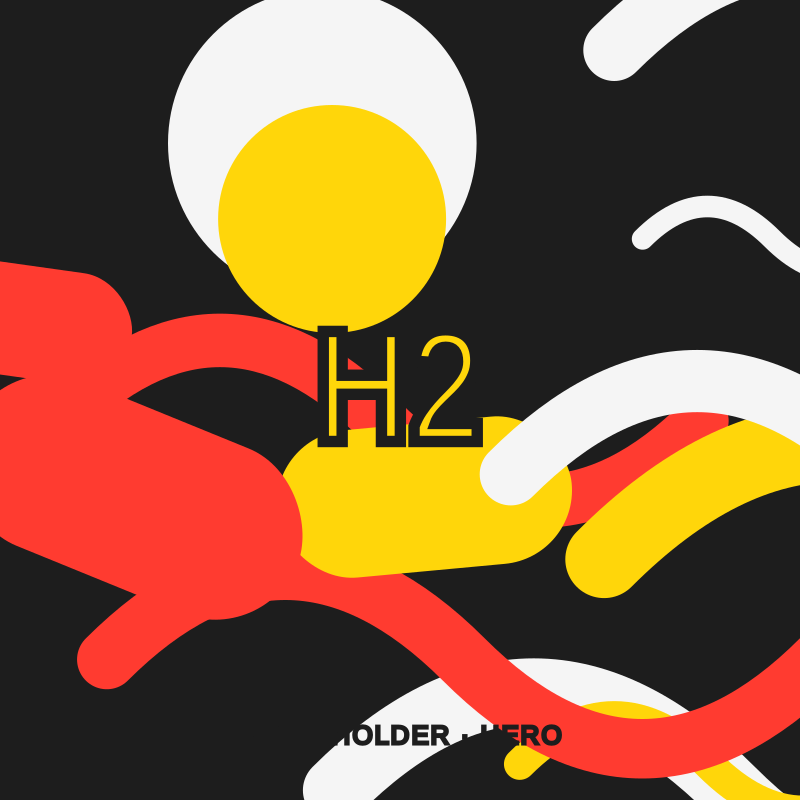
- Heading / H2Nunito Bold · 32/40 · −0.5pxMain titles, once per page
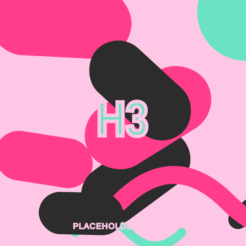
- Heading / H3Nunito Bold · 24/32 · −0.5pxHeadings for key functionality
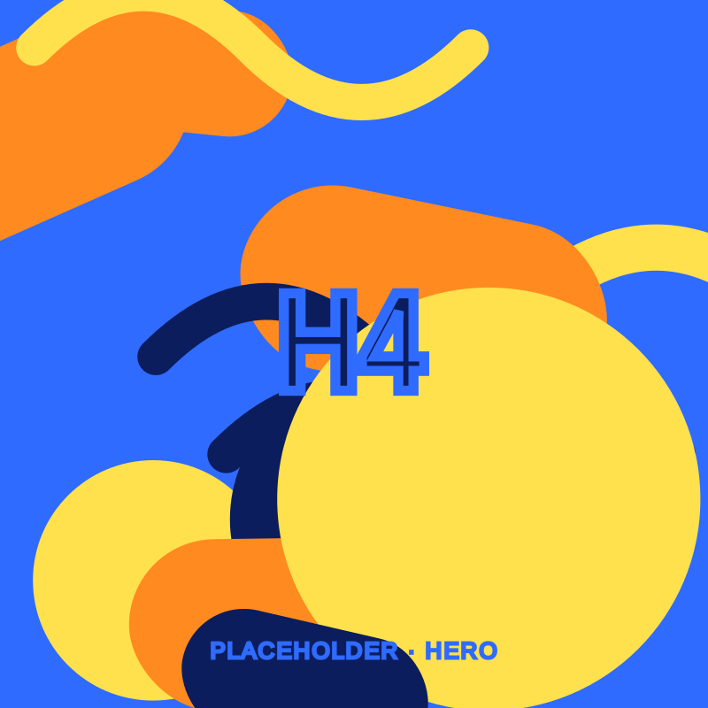
- Heading / H4Nunito Semibold · 20/24 · −0.5pxSub-sections and group headings
- Heading / H5Nunito Semibold · 16/24 · −0.25pxDeep headings and important details
- Heading / H6Nunito Bold · 14/20 · −0.25pxGroups of list items
Colour
Lulu colour system
Lulu’s colour system is built using colour primitives as raw base values, which are mapped to semantic colour aliases like Primary, Background, and Error. This approach ensures consistency, scalability, and easier maintenance across the app, and colours are applied meaningfully to UI elements, enhancing clarity and brand alignment.
- Lulu Red#ED1C24 · Logo
- Lulu Green#00A651 · Logo
- Black#000000 · Logo tagline
Design tokens
System tokens
I documented a comprehensive set of design tokens including colours, typography, spacing, shadows, and border radius to establish a consistent, scalable foundation across the Lulu Hypermarket app. These tokens act as a single source of truth, enabling seamless alignment between design and development.
Brand & icons
Iconography, logo and app icon
Creating the icon family took a thoughtful approach and some iteration, guided by clarity, alignment, brevity, consistency and ease of use.
Components
Buttons and input fields
A button is a small, often round or rectangular object that you press or click to make something happen, like submitting a form or starting a program. It’s a simple way to trigger an action or command.
Do
- Define a minimum width of 40px for each button
- Pair a primary and a secondary button for actions, based on priority
- Write clear and concise text for every action
- Use the caution style when users should decide carefully
Don’t
- Use a button narrower than 40px
- Make both actions primary in the same view
- Put descriptive label text in a button
- Use random colours that make a caution button confusing
Input fields are essential components where users enter data. In the Lulu Design System, input fields are designed for clarity and ease of use, ensuring accessibility and error reduction.
Documentation
Documented for designers and developers
Documentation is a set of detailed guidelines and resources that explain how to use and implement the system’s components, patterns, and standards. It helps designers and developers maintain consistency and efficiency by providing clear instructions on design principles, code usage, and best practices.
Before & after
The home screen, before and after
The system was part of a larger redesign of the Lulu app. Drag the handle to compare the home screen before and after.
 BeforeAfter
Results
What we achieved
With the design system in place, we established a WCAG-compliant colour framework, an enhanced responsive typography scale, and a curated library of reusable components, all grounded in research and accessibility best practices.
- Reduction in design time
- 35%
- Visual consistency
- 80%
- Faster feature release turnaround
- 50%
- Improvement in design–dev accuracy
- 45%
- WCAG accessibility score, up from 68%
- 92%
The system streamlined workflows, improved collaboration between design and development, and brought consistency across the entire product. It significantly enhanced the speed, clarity, and accuracy of execution while elevating the overall user experience.
It has evolved from a set of components into a strategic asset driving design efficiency, scalability, and brand alignment across Lulu’s digital ecosystem.